
Helping Post-Secondary Students Navigate
Off- Campus Housing with Ease
TIMELINE
Fall 2024
ROLE
Product Designer
TEAM
Just me :)
TOOLS
Figma
CONTEXT
York Montessori struggles with enrollment due to an outdated digital platform
Outdated design and unclear messaging made it difficult for parents to comprehend the Montessori philosophy and trust the school’s approach to early education
THE PROBLEM
How might we present Montessori values in a clear, approachable way that builds parent trust?
A parent’s first interaction with their child’s school should feel clear, safe, and trustworthy.
Unclear Messaging = Uncertain Parents
KEY INSIGHTS
What do parents look for?
Emotional reassurance as much as information
Instant understanding of school quality
Clear messaging, a calm visual tone, and easy navigation
A Way to Win 95% of Parents’ Trust Instinctively
To guide my redesign, I looked into psychology and UX research to see how parents make decisions about their child's early education. Using insights like subconscious decision-making, keeping choices simple, and making information easy to find, I aimed to build trust and make the site user-friendly. During my deep dive about this topic, I found an intuitive article written by Gerald Zaltman from Harvard University:
"95% of purchasing decisions happen subconsciously"
(Zaltman, 2003) .
COMPETITIVE ANALYSIS
Outdated Competitors, Untapped Opportunity
With this insight, I explored two local Montessori schools: one public and one private. Both had great reputations, but their websites felt outdated and hard to navigate. They didn’t showcase the schools’ quality or build the trust parents expect. Realizing how much modern parents rely on online research, I saw the gap: even excellent schools were losing their chance to make a strong first impression through design.
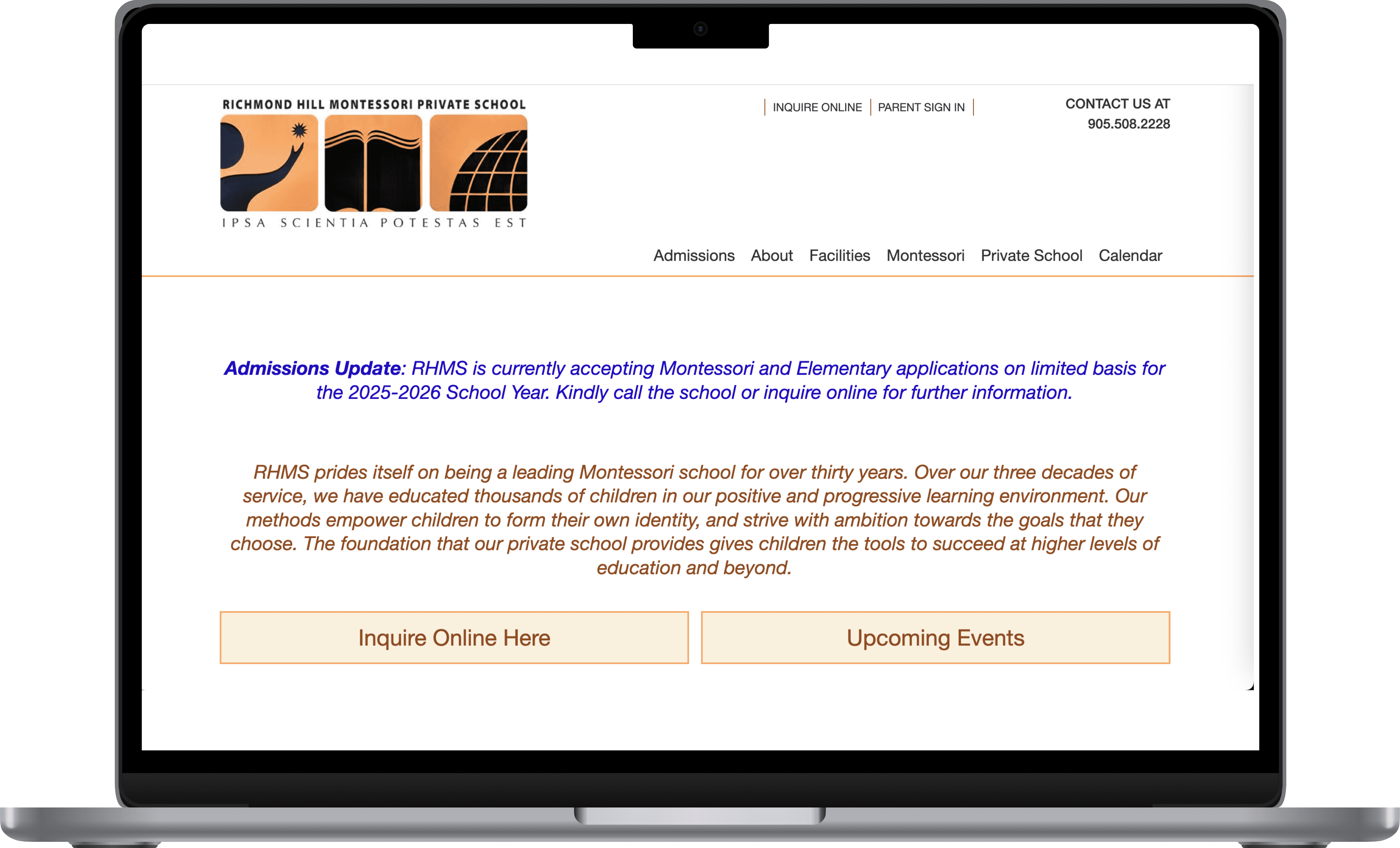
Richmond Hill Montessori Private School Landing Page
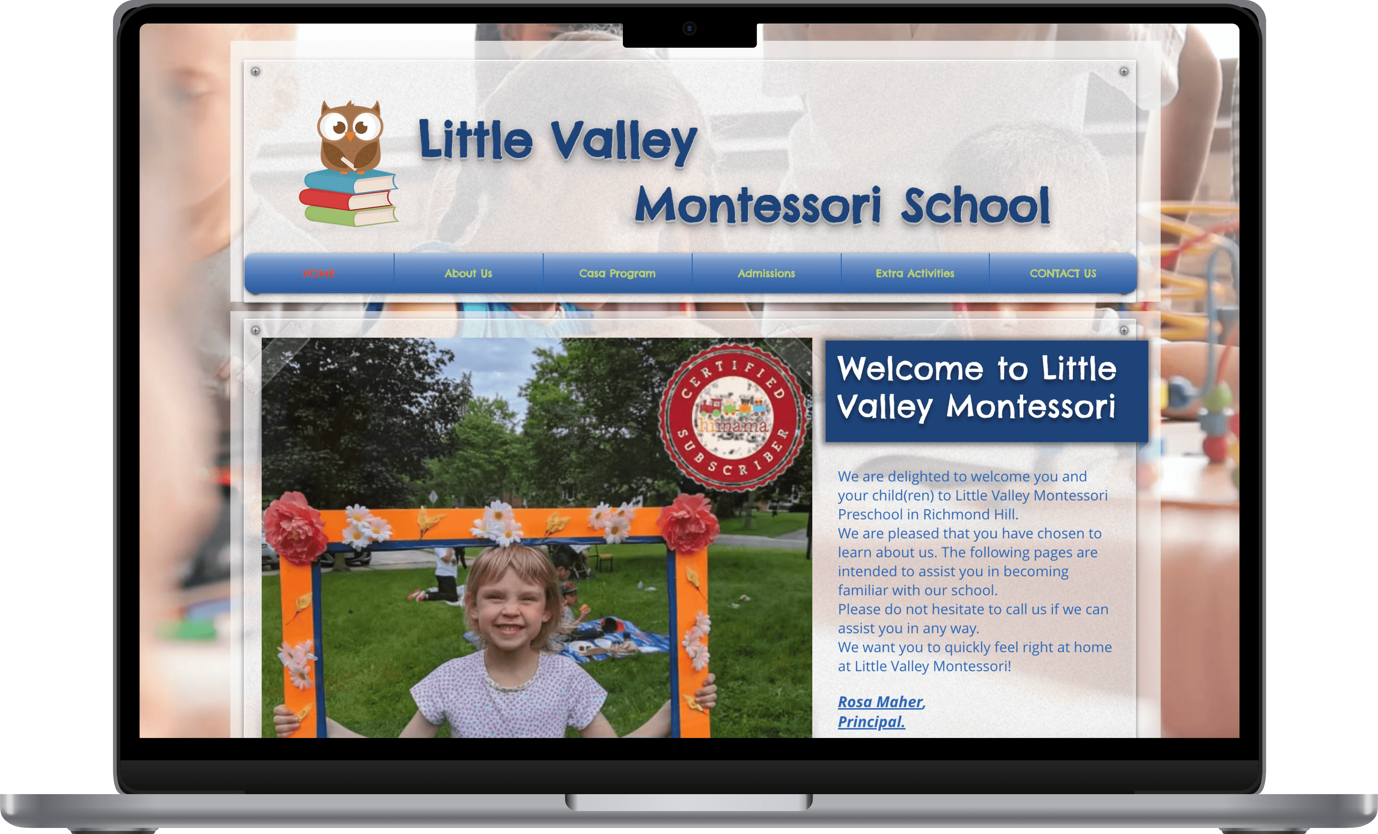
Little Valley Montessori School Landing Page
SITEMAP COMPARISON
The Path to a Successful Parent Experience
The old sitemap lacked detail and missed using subpages where needed, leaving important info all over the place. The redesigned sitemap introduces well-organized subpages to break down content clearly, making it easier for parents to find what they’re looking for and feel confident in the school’s offerings.

YMS Current Sitemap
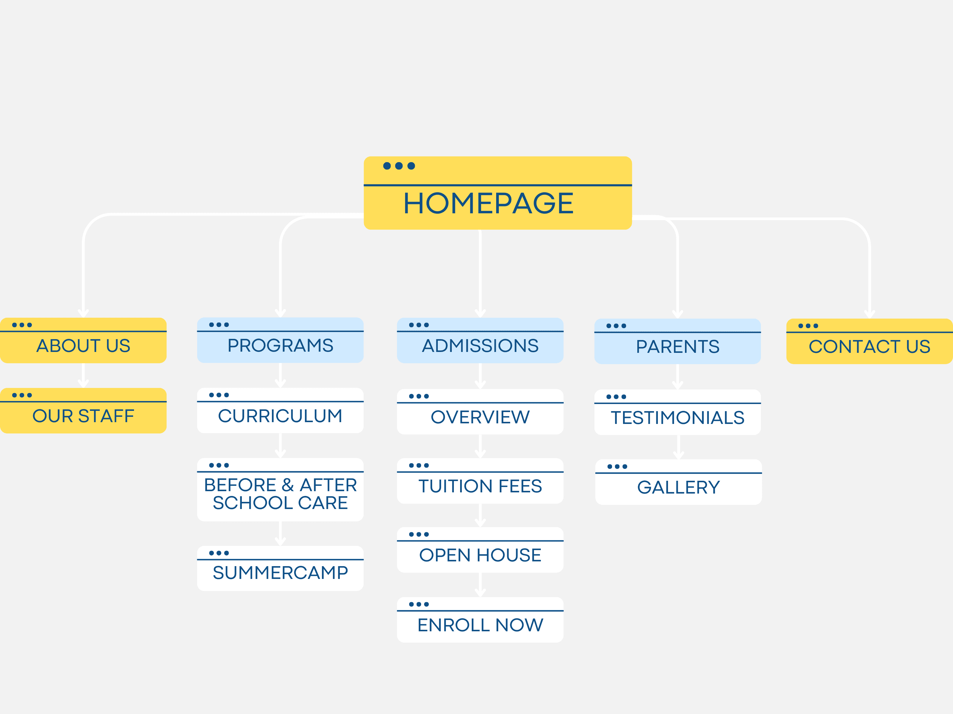
YMS Redesigned Sitemap
SOLUTION
Clear and focused content
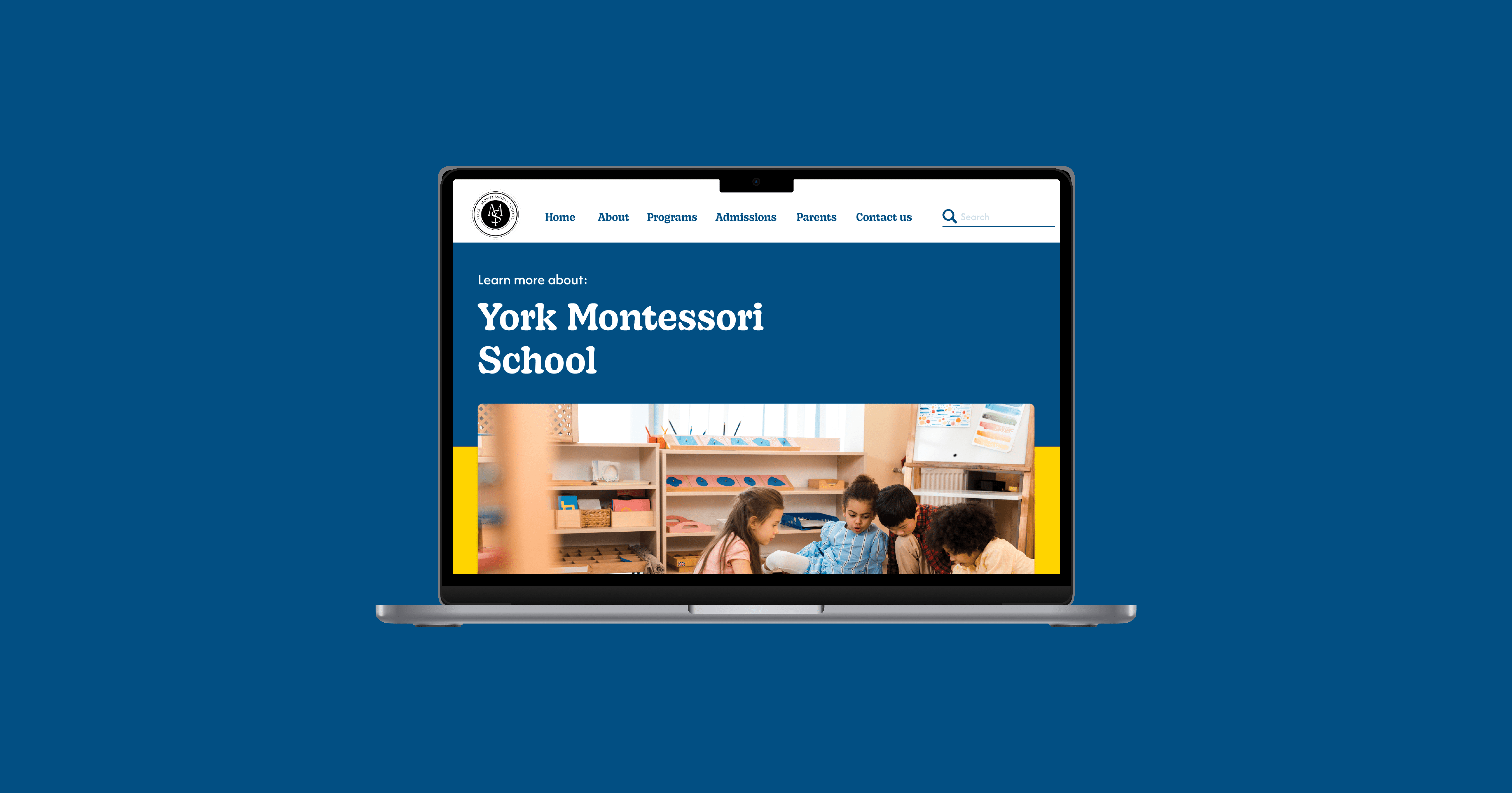
I reorganized the homepage and navigation to make key info easy to find and the Montessori philosophy clear, helping parents feel confident in the school.

Build parent confidence and connection
Used real testimonials to build credibility, featured community events to show engagement, and added FAQs and a newsletter to keep parents informed.
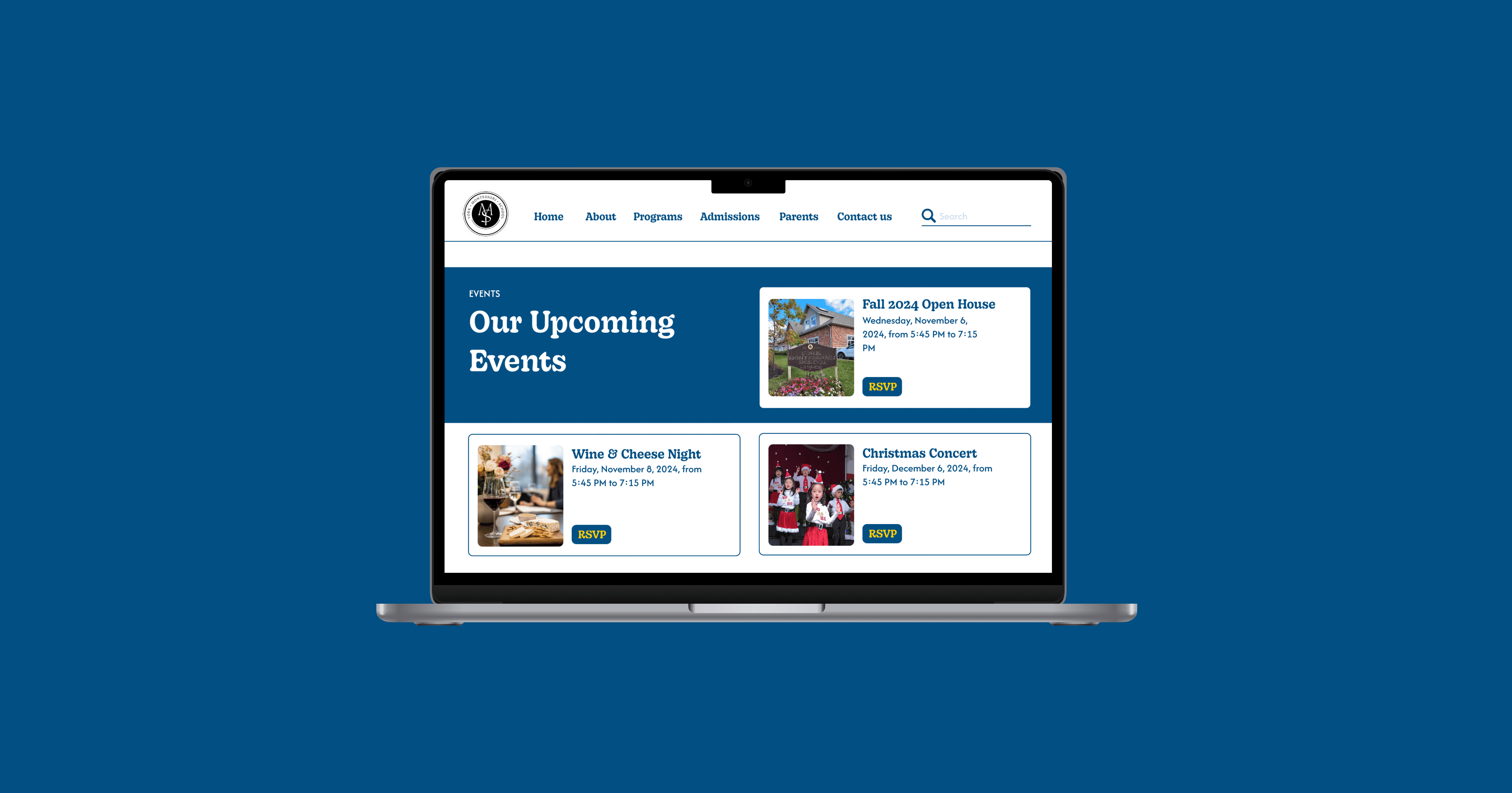
Calm and trustworthy design
Softened the colour palette, added warmth through imagery and icons, and used balanced whitespace to make the design feel clearer and more welcoming.
DESIGN DECISIONS / PROCESS
Redesigned homepage flow
Reorganized content so parents see the most important info first: school values, community events, and FAQs
Simplified navigation
Grouped related pages and reduced clutter to help parents find what they need quickly.
REFLECTION